A guest post by Suzanne Helmigh.
 Two Aliens walked into a bar,one an author and one an artist.The author alien makes his order:”Could you serve me a smooth but strong beverage that will burn like gentle oil from Neptune as it slides through my throat?” The artist alien orders, “I’d like that purple stuff with the bubbles, can I get it in one of those spiral glasses with the sugar coating?”
Many of my artist friends and I share similar experiences when it comes to working with authors on their book covers. It seems like misunderstandings or misinterpretations are a common problem, because we simply have different ways of describing things. Both authors and artists are creative people, though one thinks in words and the other thinks in imagery.
Authors tend to over-detail their descriptions, but the artist simply needs a still/fraction of the story, as if putting a movie on pause. Often, the artist gets more information than needed, which can make their vision of the image cloudy.
An artist only needs 3 things.
- The synopsis of your story.
- A movie frame instance for the cover. (If it portrays a scene/keymoment.)
- Physical description of the main object or person.
When you’ve worked on a story for a long time, it becomes dear to you. Artists make stories,too, yet they rarely get portrayed into words, so we understand how precious specific details can get. You’ve had times where you share a quick run of your story to a non-creative friend,but they drown in the details and enthusiasm of your world, loosing the plot line because they’re simply not experienced with keeping track of such things. It’s like explaining to my mother how Skype works; she’ll get parts of it, yet still tries to video-call me over Facebook.
My point with this: when you make your idea for the book cover clear to the artist, treat them like you would treat that non-creative friend or I would treat my mother about Skype. Spare them the copious amounts of detail and keep it limited to a simple synopsis, spoilers included (so a little different from the back blurb of a book.)
The next thing the artist needs is the “movieframe”.
Maybe it’s just me, as I’ve done film school and my first passion towards drawing came from wanting to become a story-boarder for films. Though most artists I know do seem to work with the same method, a simple list:
- Who: (What object or character is the main element and or side elements.)
- What: (What is going on??)
- Where: (Where are they, small description of the environment.)
- When: (This is needed for lighting; colors are different during sunset than at noon. If it’s an interior scene, simply describe what the light source is. candle light- neonlight… you see my point?)
Now the character portrayed or the object needs some description, too. We don’t need to know about the person’s history or the fact he/she is a bird lover, unless it clearly shows by all the feathers in their outfit. Let me show you a sample of a character we probably all know, and explain what’s relevant and what’s not.
- Aragorn (Lord of the Rings.)
- Middle aged. Rugged by living outdoors. Adventurer. Dark hair, blue eyes, Caucasian.
- Carries sword and elvish necklace. Color scheme of clothing matches nature.
- He’s a hero, traveler, calm and mysterious.
That’s all an artist needs. Even though we know Aragorn is actually 87 years of age, it has no relevance as he looks in his 40’s because he’s a Dunedine. Dunedine? The artist probably has no clue about any race/type/planet/order/organization names you mention, so simply don’t. He has the elvish necklace from Arwen which contains her immortality, not something of relevance for the image unless, of course, the image is a portrait of his head and shoulders and the necklace becomes a center piece. Though an image of Aragorn wielding his sword against a bunch of Orcs makes the source of the necklace far from relevant. The less items are shown in an image, the less we need to know about its details.
The big “Don’ts”.
Naming fictional elements such as races/types/planets/orders/organisations etc. When you say “Vera is a half Funderon and half human…” we have no idea how to image that. When you say, “Vera looks like a human but with rabbit ears and a flat rabbit- like face,” that brings us much closer to the visual appearance.
Don’t send the artist pages of the book unless they ask for it.Sometimes 1 page can be fine if it perfectly portrays the scene for the cover. Though, I’ve had entire chapters with highlighted portions before, and it’s one of those drown-in-the-details moments.Suddenly sneaking into a movie in the cinema midway through, and then leaving after 15 minutes, will make you very confused about the story.
Please don’t get too nit-picky about the tiniest points. The last thing an artist wants is to become a machine that loses their own vision and simply copies. The 3 different eye colors of the octo-alien in the distance really won’t be bigger than a pixel.
Another helpful thing: send the artist imagerythey can use. Maybe you fancy the look of a certain actor or you’ve seen a lasergun that really comes close to the style you’d like. Heck, you can even make a mood-board! It will only help the artist’s vision match yours better, presenting it to them in a form they understand.
I hope this will help you communicate with your artists. I’m curious to read your point of view as a writer so I can better understand you as well.
 Suzanne Helmigh Bio:
At 24 years old, Suzanne Helmigh is a professional artist who went from film to concept art and illustration. She always wrote stories as a hobby, but found her words get lost compared to her ability to create images.
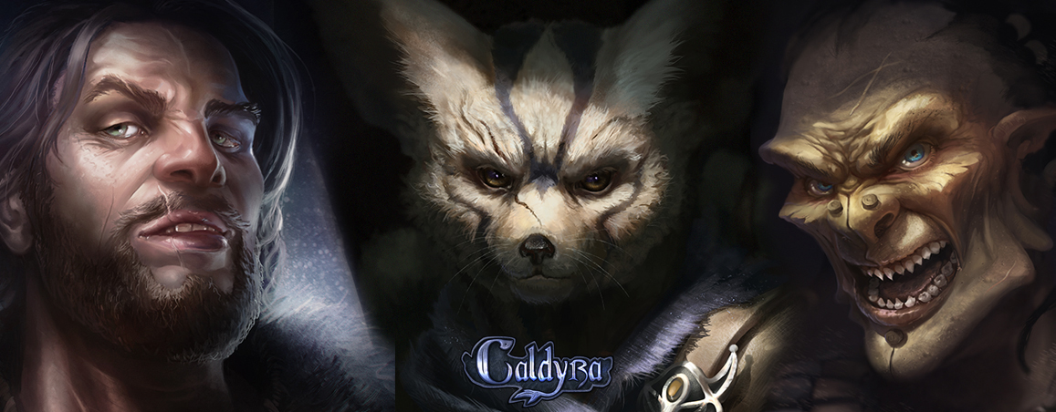
Currently, she’s working on an Artbook titled Caldyra, which will show a story portrayed into illustrations and key element concept designs–a bit of a mix between a graphic novel without words and a concept art book for animation or games. You can have a look at her Facebook fan page and let her know what you think!

I’ve always wondered about the etiquette for cover art. This is very insightful.
Pingback: The Aliens Have Left the Building - The Fictorians