Category Archives: Joshua Essoe

The Editing Hit List

At Work
At Work

What cursed names do you reserve for your editor? We know you have them. We know you give them to us. And we don’t care. We actually kind of like it.

When you work with an editor for the first time, you’ll start to shed preconceived notions about the shape your story is in. Getting that MS back bleeding and red can be a shock. But, I swear, we only do it in self-defense. I want to help you and your MS avoid some of that unnecessary blood loss.

I see a lot of things I wish I didn’t. Every editor does. I’ve already spoken about how important it is to pay attention to your submission guidelines, and what industry standard formatting looks like, so here are a few other things on my hit list.

1. Single quotation marks.

I sometimes wish writers weren’t taught they existed. In fiction writing, the most common use you’ll have for single quotation marks is to indicate a quote within dialogue. Enclose the speaker’s dialogue in double quotation marks, then enclose the phrase they are quoting in single quotation marks. You nest them, with the double quotation marks on the outside.

“So this guy, he actually growls at me, his eyes turn red, and he tells me, ‘Give me a keg of beer.'”

Is that the only time you can use single quotation marks? No, outside fiction, it’s the convention in studies like linguistics, philosophy and theology to infer special meaning by enclosing some words in single quotation marks. They’re also used by the Associated Press for headlines.

Use double quotation marks for dialogue (obviously), around titles of short stories, magazine articles, and TV episode titles; they can be used as a style choice when you are writing a sentence and you want to refer to a word rather than use its meaning, as I will in the next item on the hit list.

Double quotation marks can also sometimes be used as scare quotes. I’m sure you’ve heard the term. All scare quotes do is indicate that a word is special in some way, usually a sarcastic or ironic author showing that he doesn’t believe or buy into the meaning.

And I see . . . hell, everybody sees double quotation marks used incorrectly in this way all the time. Check this out.

2. Mixing up “a” and “the.”

I see this more than a little. And I can see you shaking your head already. You totally don’t do that, that’s dumb. Well, not so fast, Speedy. I see it a lot for a reason.

These words infer very different things. Only use “the” when referring to something or someone that has already been introduced to your story, and “a” for something new to the story.

For example, when introducing a new element, like a big, slashy red pen, upon the first mention of that red pen, it is always, “a” red pen, not “the” red pen. “The” references a specific red pen, and since the red pen has never appeared nor been mentioned in your story thus far, the characters couldn’t possibly know to which red pen you were referring when you said “the red pen.” In this instance, it would be “a red pen.”

Thereafter, since the red pen has now been introduced, and your readers and your characters know about it, it would be “the red pen.”

3. Paragraph breaks.

Give them to us. New paragraphs are important for your readers. They tell when you’re switching time, place, topic or speaker, and they break the page up so it is not a solid block of words.

Don’t downplay the psychological impact of how the writing actually looks. It is intimidating and discouraging to see huge blocks of uninterrupted text, and you don’t want your reader to be discouraged before they even start to read, right?

Paragraphs create white space on a page and that white space provides a visual and mental break for readers — like coming up for air. New thought, new paragraph. It is often a good idea to separate lines of dialogue into new paragraphs; and the same goes for thoughts.

There are a few standard times to make a new paragraph:

a. when you start in on a new topic,
b. when a new person begins to speak,
c. when you skip to a new place,
d. when you skip to a new time, &
e. when you want to produce a dramatic effect.

Some of these breaks may require a new scene, or even a new chapter, but at the least, give us a new paragraph.

4. Action sequences.

Action is usually the most difficult for writers to become proficient in. Time and again the manuscripts I work on will have the heaviest line editing concentrated in action scenes. I start hacking harder when characters do, so here are some rules of thumb.

Less is more. Use fewer words; more words merely gunk up the flow and muddy clarity. Action should be sharp and fast, your words should suit that.

Use only the actions that are necessary to show what is going on and no more. If there is no reason to include an extra dodge, sway, swing, leap, scream or twist, then don’t. Each movement should build off the last and serve to increase the stakes and the tension until the climax and resolution. If it doesn’t, cut it.

Save your big, dynamic action verbs like “slam,” or “jolt,” or “roar” for action scenes. You can only use each a finite amount of times, so save them for when they fit the scene and when they’ll have the most impact.

Anything that slows the tempo doesn’t belong. Tempo is the level of activity within a scene via dialogue, action or a combination of the two. Together with rhythm (the way scenes interact with one another), tempo dictates the pacing of your story.

Pay close attention to that pacing too. Is your story filled with action scene after action scene after action scene? The whole point of an action scene is to get the blood moving, create tension, make readers fear for your characters. It’s easy to make your readers numb by overdoing it. If your tension is getting stale, it is because you’re hitting the same emotional beat too many times. Too much action — but this can be applied to any kind of scene, any emotional beat.

When that’s happening you have to use an opposing beat. So change it up and throw in some romance or mystery. Or mysterious romance. Give readers a rest so they can step back and appreciate your action again. To put it another way, if you love bacon (and you do), and so all you eat is bacon (and you might), you’re going to grow tired of bacon . . . this is a bad example.

With that, I close my hit list to you for now, and leave you to your own devices. But I’ve got my eye on you. My big, bright, baleful, red eye. Go ahead, call me all the bad names you want. I’m here for you.
Joshua Essoe is a full-time, freelance editor. He’s been editing and writing for twenty years in one form or another, but has focused on speculative fiction in the last several. He’s done work for David Farland, Dean Lorey, Moses Siregar and numerous Writers of the Future authors and winners, as well as many top-notch independents.Together with Jordan Ellinger, Diana Rowland and Moses Siregar, you can find him waxing eloquent (hopefully) on the writing podcast Hide and Create.

Editing FAQ


Editor, Joshua Essoe

April has been a great month of posts from a bunch of awesome people who work in all the nooks and crannies of the book production process-illustrators, cartographers, designers, typographers, and, of course writers. We’ve had posts on the process from concept to completion, how to collaborate with other writers, and, of course, editing, editing, editing. Obviously a subject close to my heart.

I’d like to close out the month with some of the most frequently asked questions I get from writers, and most frequent issues I see in my day to day work as a full-time editor.

So without further ado, let’s just jump into it!


  • What is industry standard formatting?

This is the standard manuscript formatting that will be generally accepted anywhere you want to submit. It is the formatting standard by which I work as well. If a market or agent or editor needs something that differs from this, then it will be in their submission guidelines. Always go with the specifics they require and make sure to check. If they don’t specify, feel safe going with the old standard.

Specs for Industry standard: (in Word) 12 point New Courier, spaced “exactly 25 point” (not double spaced!) with widow control off; one inch margins all the way around; half inch first-line indent, header and footer; zero indentation and spacing; titles on seventh line down; and  name/title/pg# in the right-side header.


  • Should I use double spaces or a single space between sentences?

This is hot-button issue. If you don’t believe me, just bring it up the next time you’re around a bunch of writers. I’ll prepare for the hate mail now because inevitably this answer is going to make someone turn into a giant green rage monster.

The reason double spaces were used between sentences is because when people were using typewriters, editors needed a strong, definitive break between sentences. The monospaced font typewriters used didn’t create that, so two spaces were inserted. It isn’t necessary with word processors.

Whether you use one or two spaces these days comes down to a style issue. Some editors prefer one, some prefer two, however most style guides advise you use only one. As I understand it, page designers beg the use of just one to avoid the unsightly blocks of space that using two will litter a document with. If your MS is at that step, they’ll just have to remove all the double spaces anyway.

So forget the double spacing. I always recommend using just one.

Excuse me while I go lock my doors.


  • What the heck is passive voice?

A passive construction occurs when you make the object of an action into the subject of a sentence. That is, whoever or whatever is performing the action is not the grammatical subject of the sentence.

For example: “The next few hours were consumed with preparations for the journey.”

What is doing the action in this sentence? The preparations; however, the preparations are not in the spot where you would expect the grammatical subject to be-the hours are. So, to make this sentence active, rearrange it thusly: “Preparations for the journey consumed the next few hours.”

Look for forms of “to be” (is, are, am, was, were, has been, have been, had been, will be, will have been, being) followed by a past participle. The past participle is a form of the verb that typically, but not always, ends in “-ed.” Some exceptions to the “-ed” rule are words like “paid” and “driven.”

So here’s the formula for spotting passive voice: form of “to be” + past participle = passive voice.

I will sometimes call things out as passive storytelling that aren’t technically passive verbs or passive voice. I’ll mark both progressive and pluperfect tenses passive at times-note, I don’t mark them as passive verbs. When I do this, it means that there is a more dynamic way to write the passage I’ve highlighted. It could be made stronger and more vibrant with a different, more active verb. Progressive and pluperfect often present as good an opportunity as a passive verb to make your text more interesting.

Unless it is the most effective way to put something, try never to start a story off with something passive sounding. These kinds of things will often amount to personal preference. When I spot something like this, I’ll call it out so the author can decide what’s best for their story. Personally, I like active storytelling-I find it both more engaging and better able to draw pictures in my head. Most readers do.


  • How do I properly punctuate dialogue?

In dialogue, the only time you use a comma is when you are continuing a sentence after or before a tag. Note that when a comma is used, it indicates that the sentence is not over, so use lowercase when inserting a tag. Always put the comma inside the quotation marks if a tag follows the dialogue, and at the end of the tag if a tag precedes the dialogue. Use a period for everything that is not a tag.

For example:

  1. I guided her to my chair. “Sit here.”
    Not: I guided her to my chair, “Sit here.”
  2. “We need to get out of here.” His whisper sounded like a hiss of air.
    Not: “We need to get out of here,” his whisper sounded like a hiss of air.
  3. “We need to get out of here,” he whispered.
    Not: “We need to get out of here.” He whispered.
  4. She squealed, “Like, ohmygod!”
    Not: She squealed. “Like, ohmygod!” (Unless the squeal was a separate utterance.)


  • Do I write out numbers, or just use numerals? What about percentages and times?

This is one of those questions where if you ask a dozen different people, you’ll get a dozen different answers. Here is what I tell my clients.

For fiction, write out any number under 101, and numbers easily expressed in words like “one thousand.” This is the easiest rule of thumb to go by, and then let your publisher or editor make any in-house style changes they need.

As long as the number can be spelled out and still be easily understood without looking ridiculous, then spell it out.

If you’re writing dialogue, spell out all the numbers. Of course, even here The Chicago Manual of Style notes that you should use numerals “if words begin to look silly.” But the idea is that you should lean toward using words in dialogue.

All percentages and decimal fractions should be written in numerals. The only exception is for the beginning of a sentence, where the numeral would be spelled out. The Chicago Manual of Style’s general rule is to spell out zero through one hundred. Use the word “percent” for humanistic copy and the “%” symbol for scientific and statistical copy.

Normally, spell out the time of day, even with half and quarter hours. With “o’clock,” the number is always spelled out.

Use numerals, however, when exact times are being emphasized, or when using A.M. or P.M., but use “noon” and “midnight” rather than 12:00 P.M. and 12:00 A.M.

Bonus trivia-you can write “a.m.” and “p.m.” as lowercase letters with periods, or as small capitals without periods. Either way, there should be a space between the time and the “a.m.” or “p.m.” that follows. It’s more common to see lowercase letters followed by periods.

Also, when following an exact time with either, the time should be written as a numeral unless it is dialogue.


  • When do I use “which” and when do I use “that”?

Use “that” before a restrictive clause, and “which” before everything else. A restrictive clause is part of a sentence that you can’t get rid of because it specifically restricts some other part of the sentence.

For example: “Jewels that glow are worth more money.”

“That glow” restricts what kind of jewels we’re talking about, so you can’t get rid of it without changing the meaning of the sentence.

Nonrestrictive clauses include a part that can be left off without a change in meaning.

For example: “Jewels, which may glow, are worth a lot of money.”

Note that when you use a nonrestrictive clause it is set apart by commas.


  • Are there three or four dots in an ellipsis? Which do I use when a character stutters?

Use three dots when the ellipsis follows an incomplete thought; but include a period as normal, before the ellipsis, when following a complete thought.

When using an ellipsis, make sure that there is a space between it and the word it follows and/or precedes, and between each ellipsis point.

As for the second question, there is a difference between stammering and stuttering and, usually, I find the author means stammering. For that, the ellipsis is the better way to go. Em dashes are used to represent an interruption or break in thought, whereas ellipses are for trailing off, or pausing.

So, for example:

“Where is your sword-wait, you didn’t give it to them, did you?”

That shows a clean, abrupt break in the thought. If you replace with an ellipsis:

“Where is your sword . . .? You didn’t give it to them, did you?

This shows trailing off in thought before the beginning of a new thought.
If you combine you may get:

“Where is your sword . . . wait, you didn’t give it to them, did you?”

That is incorrect because you should finish and punctuate your first thought before going on to the next.

So, “I . . . I don’t know.” is the way to go for a stammer. “I” is a whole word, and thus should be treated as any other whole word.

If you were going for a stutter, you would use a hyphen thusly:

“I . . . I d-don’t know.”

The hyphen shows that the character utters the same sound multiple times while trying to get out a single word. (Since “I” is a whole word, that fact takes precedence over it also being a single sound.)


I’m quite out of room, so hopefully that answered some of your questions . . . and hopefully no rage monsters are now beating out responses with two spaces before each sentence.

Joshua Essoe is a full-time, freelance editor. He’s been editing and writing for twenty years in one form or another, but has focused on speculative fiction in the last several. He’s done work for David Farland, Dean Lorey, Moses Siregar and numerous Writers of the Future authors and winners, as well as many top-notch independents.

Together with Jordan Ellinger, Diana Rowland and Moses Siregar, you can find him waxing eloquent (hopefully) on the writing podcast Hide and Create. Don’t forget to check out the workshop that he and Kary English have created for this fall! Caravel Writing Workshop with Kevin J. Anderson, David Farland, Rebecca Moesta, and Grammar Girl, Mignon Fogarty, instructing.

Typography: A Tale of Two Covers

Author, Jess Owen
Author, Jess Owen

A follow-up by Jess Owen to yesterday’s post on typography.

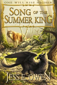
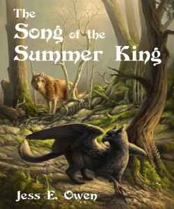
When I set out to self publish Song of the Summer King, I knew I wanted everything to look “traditional.” I wanted it to look polished and professional, like something put out by one of the Big Six. I invested in the artwork by hiring a freelance artist who’s well known for her fantasy, wild life and particularly gryphon artwork. I invested in an editor with a great track record who I believed understood my goals for the story. I had plans for a big Kickstarter fund raiser, and wanted to hire a printer instead of going POD.

With all that done, somehow, I still thought it was fine to slap some letters on the front in a free, “medieval-looking” font, and call it a day. Fortunately my friends had my back. Josh Essoe sent my cover art around for some critiques from some pros, and very honestly told me, “You’ve invested too much in this book not to get some professional lettering on the cover. Talk to Moses Siregar; he’s put the same kind of effort into his work.”

So thanks to the power of author friend networking, I contacted said successful self-publisher and he gave me the name of his typographer, Terry Roy. She seemed excited about the book, I liked her portfolio, and so she put together a package deal to not only do lettering on the front of the e-book and the hardback edition, but to handle the interior layout and format the books for printing and uploading to Amazon. And thank goodness she did.

I think sometimes we self-published authors think we have to do everything ourselves. But just as I would hire a professional to tune up my car, I now know the value of investing in professionals to wield their magic over my stories. It’s a matter of time, energy, and expertise.

I’m so happy with the final product and with the team that fell together to make it happen. I truly believe all writers need a master mind group to make their work really stand out, and I know for my book, I couldn’t have asked for more. Below you’ll find my cover before and after the professional typography and design.

AFTER
AFTER
BEFORE
BEFORE


Jess Owen has been creating works of fantasy art and fiction for over a decade, and founded her own publishing company, Five Elements Press, to publish her own works and someday, that of others. She’s a proud member of the Society of Children’s Book Writers and Illustrators and the Authors of the Flathead. She lives with her husband in the mountains of northwest Montana, which offer daily inspiration for creating worlds of wise, wild creatures, magic, and adventure. Jess can be contacted directly through her website, or the SOTSK facebook fan page.

Book Blast For Ben Wolverton Today!


As announced in yesterday’s post about David Farland’s son, Ben, the Book Blast is here! Please browse the titles and buy for yourself, buy for your friends, and share to everyone you know.

Please note, if you click through the Amazon links embedded below, Dave will get a percentage of ANYTHING else you buy while there!


Kindle Edition
Kindle Edition


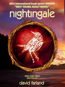
Nightingale

Some people sing at night to drive back the darkness. Others sing to summon it. . . .

Bron Jones was abandoned at birth. Thrown into foster care, he was rejected by one family after another, until he met Olivia, a gifted and devoted high-school teacher who recognized him for what he really was–what her people call a “nightingale.”

But Bron isn’t ready to learn the truth. There are secrets that have been hidden from mankind for hundreds of thousands of years, secrets that should remain hidden. Some things are too dangerous to know. Bron’s secret may be the most dangerous of all.


Kindle Edition
Kindle Edition


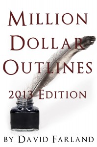
Million Dollar Outlines

If you are a writer, you may want to consider purchasing David Farland’s MILLION DOLLAR OUTLINES. It has been a bestseller on Amazon for over a month and is only $6.99.

As a bestselling author David Farland has taught dozens of writers who have gone on to staggering literary success, including such #1 New York Times Bestsellers as Brandon Mull (Fablehaven), Brandon Sanderson (Wheel of Time), James Dashner (The Maze Runner) and Stephenie Meyer (Twilight).

In Million Dollar Outlines, Dave teaches how to analyze an audience and outline a novel so that it can appeal to a wide readership, giving it the potential to become a bestseller. The secrets found in his unconventional approach will help you understand why so many of his authors go on to prominence.


For updates on Ben’s condition, the details of what happened, or to make a donation please visit the site James Duckett was kind enough to build here.