A guest post by Holly Heisey
So you’ve just finished your masterpiece. Maybe, like me, you focus on the story in the first few drafts and the world itself is a colorful blur. If an artist asked you right now to describe the feel of your world for your book cover, could you do it?
Or maybe you lead with description, your prose so gorgeous a reader could live in it. You know all the details of your world, and you can describe any object in a given room. But could you describe the visual feel of your world? Could you pare down the details?
As an artist, I work with authors all the time on distilling their visions into cover art. Most authors know their story well, and many have a good idea of what they’d like on their cover, but they often have a hard time translating those concepts into visual ideas. A visual representation of a story is a different medium than the story itself. A cover, unlike a summary, shouldn’t describe the world, but invite the reader into it.
So how do you translate the vision in your head for an artist?
First, gather reference. Artists love reference—it’s like gold for dragons. Have you ever dream-casted your novel or collected images that looked like places in your world? That will come in handy now. Try breaking your world into four categories: people, places, things, and ideas. Google image search, Pinterest, Behance, and Artstation are your friends. Gather photos and paintings of things that could inhabit your world. For the idea category, put in images that evoke the emotions, themes, or specific scenes in your story. Building the visual feel of your book is a lot like finding your novel’s theme as you write. You’ll know it when you start to see it.
Here’s an “idea” Pinterest board for one of my story projects:
The next step is research of a different sort. A lot of authors overlook market research, but it’s too important to skip! Your cover is an invitation, but it’s also like a secret visual code. Your cover, if targeted correctly, will tell a reader exactly the kind of story they’ll get in under two seconds. A good cover artist will know the market trends, but you should know them, too. You might give your artist a beautiful description of your world and they’ll make a beautiful cover, but if your novel is adult fantasy and it reads at a glance as contemporary YA, that’s a serious setback. You want to give yourself as much advantage in reader expectations and sales as you can.
The quickest and most targeted way I’ve found to do market research is to run two searches: the first in your book’s specific ebook categories on Amazon, and the second as a more general search on Goodreads. On Amazon, look at the current ebook bestseller listings for your specific categories. The ebook charts will give the truest feel of the indie market—you’ll see exactly the kinds of covers that are selling books right now. Some of these covers will be amazing, and some…not so amazing. But most of them will have pieces of the visual tropes—or code—for that genre.
As an example, if you’re writing space opera, bestselling books often have starships. Big, colorful, epic starships. Those that don’t are still colorful and epic, sometimes with characters in action. Lots of blue/green, lots of red/orange. Lots of shiny tech and lens flares. This is the genre code for space opera.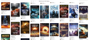
Save the covers you like and that are similar to the visual feel you discovered while gathering reference earlier. And once you have a few favorites, it’s a good idea to look them up on Goodreads and explore the “readers also enjoyed” links. This will open up your search to books published in the last five years and bring in more traditional publishing trends. Study these, too. Collect your favorites. But be careful not to collect more than a few covers from over five years ago, as chances are the trends will have changed.
Now that you know the visual feel of your book and the cover tropes of the audience you’re targeting, look again at the references you’ve gathered for the feel of your story world. What are the big things and recurring trends? What evokes the most emotion? Write these elements down in a list. Look at the genre covers you’ve just gathered. What are the genre codes you want to target? Write these elements down, too, and compare the lists. Where do they match up? What gives the stronger image? For example, if you have an urban fantasy with a cool fight scene in the forest, but most of the book takes place in the city and that will make the stronger marketing image, you’ll need to decide what best represents the book as a whole.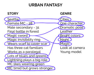 Not everything needs to match up, and you don’t need to hit all of the genre cover tropes—it’s probably a good idea not to. You want your own twist on this, within the genre. Look for the things that will make your cover stand out. But keep in mind, too, that the tropes are a visual code that people will read, whether you send the right signals or the wrong ones. Make sure your ideas hit at least a few tropes in your genre.
When you’ve found the elements you like, describe them in detail. Break them again into people, places, things, and ideas, and describe every detail of your main character or characters (physical appearance, clothing, emotional and mental states), the strongest places and most interesting settings, any objects or effects the characters or places might need, and any other cool things that might help convey the emotional feel. If the genre you’re targeting has covers that tend more toward abstract design than characters or scenery, still describe it all, paying particular attention to props and emotions. Include some of the reference pics you’ve gathered for each category, and some of your favorite covers that are similar to what you’d like for your book.
And that’s it. You now have a solid page or two of workable details and visual guides to take to an artist, who can help you hone your vision from there. This is a great process to do if you’re self-publishing, but I think it’s valuable for authors aiming at traditional publishing as well. You’ll know exactly how to describe your world to anyone who asks. And you’ll know your world better for yourself, which is the true gold.
About the Author:
Holly Heisey is an author, illustrator, and designer with a love of spaceships and a tendency to quote Monty Python. They’ve had stories in Intergalactic Medicine Show, Clockwork Phoenix 5, and Escape Pod, and have designed and illustrated for The Magazine of Fantasy & Science Fiction, The Future Chronicles anthology series, and USA Today and Amazon.com bestselling authors. Holly lives in Arizona with their pet cacti, enjoying the heat and plotting to take over the world.
You can find Holly at http://hollyheiseydesign.com, on Instagram @hollyheiseydesign, and Facebook at https://www.facebook.com/hollyheiseydesign/


 Yes, this is an option. You can set your mutant giant ant story in Nevada, and they all die because they’re allergic to saguaro cactus. The problem with this is saguaros live in the Sonora Desert in Arizona.
 You could always make up an establishment, but make sure you’re vague enough that people can’t say, “Oh, that’s where DiFara’s Pizza is. He’s been there since 1965. Also known as one of the very best places to get a pizza in the galaxy.”

